Remembrance Photography

"The Now I Lay Me Down to Sleep Foundation is there for parents and families to help aid them in their HEALING, bring HOPE to their future, and HONOR to their child. It is through REMEMBRANCE that a family can truly begin to heal."

Tuesday, October 22, 2013

15 Tips to Improve Your Photography

Whether you have a point-and-shoot camera, a tablet, camera phone, or a DSLR, there are some composition tips you can practice to help your photos look better without editing.  Here are my favorites.  (Let me say here that I consider myself at an intermediate level in photography and am by no means a professional. Also, this is nothing you couldn't find with a simple Google search.  All of the photos were taken by me with the exception of the grid--which I got off the Internet--and the family portrait on the final tip, which was by Colton Spencer.)  ~Cami Evans

1 - Lighting Trumps Background
So, so, so much can be said here about good lighting, (especially considering "photograph" literally means "image of light"), and I would highly recommend studying light and shadows if you want to learn photography.  But for this tutorial, start by learning about open shade.  For starters, don't let your subject look into the sun when you take their picture.  Place the sun behind or to the side of the person/thing you want to photograph, so nobody's squinting and the lighting is even.

Remember, the background of the photo is not as important as the lighting!!  If there is something you really want a picture by but the lighting is poor, try taking the photo from another angle or at a different time of day.

Family reunion shot posed in open shade (the trees were behind us, not above us) so the lighting is even across everyone's faces (no sun spots or harsh shadows).


2 - Look for Catchlights

A catchlight is a gleam of reflected light in the eye of a person or animal in a photograph.  It is what makes the subject look alive. To achieve catchlights in a photo, the subject needs to be facing the light source.  This takes practice!  Look for the catchlights in their eyes before you take the photo and move them around until you see the sparkle.

My favorite way to light my kids indoors is to open the curtains when the sunlight is bright but not coming in directly, stand with my side to the window, and have them face me.  The light reflects in their eyes without blinding them.

3 - The Rule of Thirds

Above anything else, practicing this tip will dramatically improve your photography!

The "Rule of Thirds" is when you split your photo into thirds vertically and horizontally and emphasize your subject at the intersections. To do this, draw a tic-tac-toe board over your viewfinder/photo in your mind.  Position your subject at one of the four intersecting corners in the grid shown in red above--these are "power positions" in a photo.  Basically, stop centering everything in your picture!  (If you can't quite master the rule of thirds while taking pictures, you can always crop them later to emphasize a power position, but try to learn how to do it without editing!) 

Placing the subject in the lower left of the photo draws your attention to her immediately and is more pleasing to the eye than if she were sitting in the middle.  You see her, then you look around the photo.

If you can't get the subject to be in one of the four power positions, at least push them to the outer quadrants of the photo instead of centering them.  It still directs your focus to the subject first.

A person's eyes are the subject of a portrait.  Do your best to place their eyes at the top line of your tic-tac-toe board.  Here, her right eye is at the top left power position.

The flag in focus is on the lower left power position.

4 - Simplify.

Pay attention to extraneous things in your photo before you snap the shot.  Remove anything in view that does not contribute to what you want to convey in the picture.  The saying goes, "If in doubt, take it out." If there is a garbage can in the background or a light pole that seems to be coming out of a person's head, move the garbage can or move yourself or your subject around until it is no longer in the frame.  Look around the whole area before you take the picture.

There is nothing in this photo that does not tell the story in it.

5 - Framing

Put things in the foreground of your photo to create a frame around the subject.

Looking through the wagon wheel and keeping part of it in the photo adds a frame around his face.

Framing the temple with greenery (and placing it in a power position!).

6 - Change Your Perspective

 To me, this is the most fun composition tip.  Look at things a different way.  Shoot from high above, down below, far away, or whatever you can think of and try to think out of the ordinary.

Walk right up to the trunk of a tree and look up.  Don't worry about getting the whole tree in the photo.

Look through their eyes.

Pay attention to shadows.

7 - Place Heads at Different Levels

When taking photos of groups, place their heads at different levels instead of all lined up.
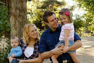
The slant from lower left to upper right of their heads creates direction in this photo.

8 - Squish together!

People need to be closer than they think. There should be no background showing between people when they are posing close together.

Leaning in and scooting close shows the family's relationship.

9 - Cropping 

Cropping photos is fun.  But here I'm not talking about cropping with software on the computer; I'm talking about purposely cropping things when you compose the photo to create the look you want.  Look at things more closely.  Fill the frame with your subject.  It's okay to crop out a person's forehead but be careful to not cut out their chin because it will make you wonder what happened to their body.  Try to crop limbs well away from joints so they don't look amputated.  
 
Cropping out the dad puts focus on the son.

10 - Put Men in Masculine Positions & Women in Feminine Positions

There are books on posing, so this is just scratching the surface on this topic.  Masculine positions include: the face leaning toward the body to create a 'C' shape, the body facing the camera straight-on to show power and strength, hands/arms in more harsh or straight angles, and showing the back of the hand to the camera.  Feminine positions are the opposite: the face leaning away from the body to create an 'S' shape, the body turned at an angle to the camera for an instant slimming effect, hands/arms softened and light, and the side of the hand facing the camera.

My favorite part about this tip is that females can do feminine or masculine poses (depending on what you're trying to convey), while men should stick to masculine ones.

Tip Inside a Tip: If someone wants to take your picture and it's not for a passport, please don't face the camera directly.  Step one leg back and lean on it.  Lean your back shoulder toward the camera just a little.  Tilt one ear back an inch and smile.

His head is leaning more toward his chest than his back.  If you drew a line from his head, through his body, to his feet, it would be a 'C.'  (If his head were leaning back over his shoulder, it would put him in more of an 'S' shape and make him look feminine.)

Facing the men straight at the camera adds power, intensity, and masculinity.  They are each naturally leaning their heads towards their chests in the 'C'-shape.

After my hair was cut tragically short, I spent months growing it to this length where it finally laid down.  Wanting to take a self-portrait that conveyed the strength I desired to feel, I purposely leaned in a 'C'-shape, put the back of my hand to the camera, and put my left arm at a right angle to add just a touch of masculinity to the pose.  (See how I also cropped part of the image and placed myself in a power position?)

11 - If it bends, bend it.

Repetition gets boring so if something repeats, make it different.  (That applies to music as well.)  What this means for photography is "if it bends, bend it."  Keep arms from hanging down at the sides by bending one or both of them.  Lean on one leg and bend the other.  Change things up!  Also look at how this tip was put into action in the group shot under tip #10 above.

Let people pose themselves comfortably.


12 - Try something besides "Smile!" or "Say cheese!" 

You will have to get creative in order to get genuine smiles out of people.  Be the clown.  Make funny faces.  Ask them to do them with you. Dance around.  Be silly.

Here I called out, "Say stinky feet!" and clicked the camera when she laughed.

13 - Shoot from above to flatter just about anyone

Whatever is closest to the camera will look larger, so if your eyes are closer than your waist, you will look skinnier.  Taking pictures from up above makes just about anyone look good.  (The first photo under tip #10 was purposely shot from above.)

What pregnant woman wouldn't have you look in her beautiful eyes and see her smile over her ever-growing belly sometimes?

14 - Shoot at or below eye level, especially with kids

If you're short like me and can't always shoot your subjects from above to flatter their figures, the rule of thumb is to shoot at eye level.  For children, that means squatting down to their height.  I also like to shoot from below to make them look taller.
 
I was laying in the grass looking up at her.

15 - Take it with a grain of salt.  


Wait, I thought there wasn't supposed to be space between the subjects or heads at the same level? 

So much for keeping the subject out of the center!

Look, photography is an art, which means it is judged subjectively.  What makes a "good" photo is up for debate and a matter of opinion.  So take pictures of what you like.  Feel free to break the rules if that's what you want to do.  Express yourself and don't worry too much about what other people think.

Tuesday, June 19, 2012

Months in the Making

Back in April I completed this fun maternity project. I call it "Months in the Making."

I took photos of my friend Anna Rose at 3, 5, 7, and 9 months pregnant, and then one last shot with 2-week old baby William and compiled them with Photoshop.  I love how it turned out!

Saturday, June 16, 2012

Photoshop Actions

Martin and I have become friends with Colton Spencer in our ward.  He is about my age and is a professional photographer.  He is kindly showing me the ropes.  He came over a couple weeks ago and spent about an hour showing me some valuable things:
  • Workflow through Bridge, Camera Raw, and Photoshop
  • How to write Photoshop Actions to batch process and save images
  • How to create my own watermark and create an action to add it to photos
  • When working with clients be upfront about expectations then "underpromise and overdeliver." (Say it will take you a month to edit and then get it done in one week, for example.)
  • How to use the Curves layer in Photoshop rather than the histogram
  • How to sharpen eyes and whiten teeth
  • He actually downloaded several sets of Photoshop Actions for me to use free of charge!
  • At another time he's going to show me how to make HDR images in Photoshop, how to merge pictures, how to use Liquefy to make people skinnier, and how to use a make-up action (to actually apply make-up to people's faces!).
  • This was all just after he did a photo shoot for my family.  It was amazingly relaxed and fun and the girls did wonderful.  He edited the photos for me but also gave me the RAW files so I can practice editing as well.
Colton's Edit

My Edit 

Colton is the mentor I have been looking for.  He is eager to help and share his knowledge and answers all my questions.  I am still extremely hesitant to seek photo shoots and just see this as a hobby right now but hopefully I can push out of my shell as my skills and knowledge grow.

Friday, November 11, 2011

Wray Maternity Shoot

This morning Sydney and I went over to a friend's house and did a little maternity photo shoot.  Sister Wray is due to have baby #2 around Christmas Day (in about 6 weeks). I used my 50mm f/1.8 lens to get some practice.  (A couple shots would have been a lot easier with a wider angle but we figured it out.)

We tried a few indoor shots and I like this one the best.  (I used the black reflector to put a shadow side on her.  It might be a little too much but I like the effect.)
ISO 1250, f/2.8, 1/60

This is my favorite shot from the day.  The leading lines are perfect, the shadows give good depth without being distracting, and she looks comfortable.  (I would have liked to see all of her boots but my vantage point wasn't ideal.  I still need to get myself a good stepladder!)
ISO 100, f/2.8, 1/250

We had to get some shots in the red leaves so in order to keep the parked cars around us out of view, she had to sit down while I stayed up high.  It was a bit hard for her to get comfortable against that tree with her cute baby belly but I think these last few shots look nice.
ISO 100, f/2.8, 1/400

I need some more ideas on posing maternity shots without a second person and no props she wanted to hold.  (It kinda looks like she's praying.)
ISO 100, f/2.8, 1/320

This shot just makes me smile.  It reminds me of my own pregnancy photos.  What a cute belly she has!
ISO 100, f/2.8, 1/640

I came home feeling frustrated, mostly because Sydney had irritated me the whole time instead of doing what I asked (which was our agreement for letting her tag along), and while I did indeed discard many of the photos we took, I am very pleased with how these turned out.  It is interesting to notice that 4 out of my favorite 5 have her in the same basic orientation plus one classic headless belly shot.  I guess we know where my sweet spots are for maternity posing!  

I felt a little more in control of the posing in this session than before--at least more aware of my instructions and doing my best to help her be relaxed and look good (no funky bumps in the shirt or smooshed looking baby bellies).  Practice is tough but it is making me better!

I am doing another shoot for a friend on Monday.  She recently bought an awesome camera (Nikon D7000) and is learning how to use it.  She is also pregnant with baby #2 so it will be a maternity shoot.  I am hoping we can work together and help each other out with what we think the pictures should look like instead of bumping heads as we both find our styles (and as we both feel a little intimidated by our cameras!).  She, however, is a whiz at Photoshop (which I am getting for Christmas!!), so she has agreed to show me the ropes with that and I am excited to learn.  Photoshop has so many bells and whistles that I'm not sure what to do with it but I have been exposed to it in the past and would love to have more control over my RAW files as well as use it for other non-photography things.  

This is a process and I am far from professional but I am feeling more and more confident behind the camera and don't take as long to get set up.

I do need natural light so I can keep my ISO low, so I am worried about the impending winter!  I may invest in a dedicated flash unit sooner than later!

Tuesday, November 1, 2011

Photo Tips from Scott Kelby

I checked out several photography books from the library.  One is a "Canon Rebel For Dummies" book that helped me understand all the buttons and menus and abilities of my camera.  I'm very glad I got that!  Another is "The Digital Photography Book, Volume 1" by Scott Kelby.  Without going into all the technical jargon most photography books describe, he offers great tips on capturing meaningful photos, offering his tidbits of advice as if I were on a photo shoot with him asking questions.

I like all the tips in the book and am considering purchasing the book but when it really comes down to it, I mostly just want the tips on portrait photography so I'm going to type up as many tips as I can before the book needs to go back to the library. I feel a little odd stealing all this info since I didn't buy the book, but it's not illegal to copy pages from books at the library!

*To avoid camera shake, try using a tripod with a remote and/or the self-timer setting.

*Zoom in on the LCD playback screen to check sharpness as you shoot.

*Photoshop sharpening:
1) Open the photo and apply the Unsharp Mask using these settings:
1 - For people: Amount 150%, Radius 1, Threshold 10
2 - For cityscapes, urban photography, or travel: Amount 65%, Radius 3, Threshold 2
3 - For general everyday use: Amount 85%, Radius 1, Threshold 4
2) Before you do anything else, go under the Edit menu and choose Fade Unsharp Mask.
3) The only thing you do here is change the Fade dialog's pop-up menu from Normal to Luminosity.

*Try wrapping the camera strap around your arm just above the elbow and then around the wrist and hand to form a tight grip to steady handheld shots.

*Consider a Canon Close-Up Lens (specific to your lens since it screws on the end) for macro shots on a budget.

*Shoot flowers on cloudy, overcast days or just after rain.  Or use a spray bottle of water to fake raindrops.

*Put a black backdrop behind flowers for a dramatic look.  Try a yard of either black velvet or black velour and hang it on something a few feet behind the flower.  OR put a white foam board behind the flower for a nice white background.  (A second foam board can be used to reflect light at an angle to make sure it looks white.)

*If you're shooting in very high ISOs at weddings, you'll want to know about a popular Photoshop plug-in for wedding photographers called Dfine 2 (from NikSoftware.com). Besides reducing noise, a happy side effect is that it also smoothes skin.

*Use flash at outdoor weddings as fill flash.  Point it to the side at a 45 degree angle.  Also consider a -1 flash exposure compensation so it will still help lift the shadows without being so obvious.

*Keep memory cards on your person when doing an important shoot (like a wedding) so you don't have to run and find your bag at a critical moment.

*When shooting large groups for formal portraits, use an aperture setting that will get everyone in focus--f/11 is reasonable.  Then focus on the eyes of the people in the front row so the whole shot isn't a bust.

*Ask subjects to close their eyes and count down from three then wait a second before pressing the shutter.  "Okay, everybody close your eyes. Now open them on 3-2-1... open!" Then wait a count and take the shot.

*Camera Height: For a head and shoulders shot, camera should be eye level. For a 7/8 shot, camera should aim at the chest. For a standing full-length, the camera should be waist level.

*Ideas for wedding shots: the bride's shoes, the bride's dress hanging on a hanger, the bride's tiara, necklace, etc., the wedding invitation, the sheet music played at the wedding, the guestbook after a few people have signed it, their champagne glasses, name cards at the reception, their wedding rings (perhaps posed on the invitation), the airline tickets for their honeymoon, the sheet music or CD jewel case for their first dance, the groom's boutonniere, the bride's bouquet, and any fine detail in her dress.

*Use a wide-angle lens at weddings for the rice throwing, the whole reception area, the wedding scene, and the bouquet toss and garter toss.

*Back up your photos onsite, preferably with a unit that allows you to copy the images directly from a card without a computer.

*Particularly with landscape photography, remember the elements of foreground, middle ground, and background.

*For warmer sunrises/sunsets, go to Cloudy white balance then select WB SHIFT/BKT and move the dot to the right three spots.  (Don't forget to turn it off afterwards though!)

*Turn on the highlight blinkies and pay attention to where the detail is.  (Then adjust with exposure compensation about 1/3 at a time.)

*For sports photography (or movement photography) where you know where the action might be, you can pre-focus by pushing the shutter halfway while on autofocus, then switch to manual focus, and wait for the action before taking the picture.

*For sports photography, don't just shoot the winners.  Pay attention to the people that miss the shot, too.

*The 85-100mm range is often called portrait lenses because they shoot from a good working distance without distortion.

*For indoor portraits with a solid background, use aperture of f/11.  (For outdoor and more creative shots, f/2.8 is good to blur the background.)

*For backlit sunset portraits without making a silhouette, turn off the flash and aim at the sky. Hold the shutter halfway down to take an exposure reading from the sky, and while still holding it down halfway recompose by aiming at the subject.  Now turn your flash on and reveal your subject with the light of the flash. This way, your subject gets fill flash, but the sky behind them still looks great.

*Cold weather keeps batteries from lasting long so keep back-ups ready!

*A lens hood not only keeps out sun flare but it also protects the lens.  UV filters also provide damage protection for lenses.

*If your battery is running low, limit your LCD time.  (Turn the Review Time down or off.)

*Bracket if you're not sure about exposure.  (Or shoot in RAW.)

*To keep from accidentally erasing memory cards, turn full cards upside-down in a card holder case.

*Many public places don't allow tripods but monopods are okay.

*To shoot fireworks, use a tripod, a remote, a zoom lens (ideally a 200mm or more unless you want to capture the background and the fireworks, so use a wider lens).  Use Manual mode, set the shutter speed to 4 seconds, and the aperture to f/11.  Fire a test shot and look at it for any needed exposure compensation changes.  Now time it for when the rockets shoot up through when the light trails begin to fade.  (Also try putting it in Bulb mode--where the shutter stays open as long as you hold the shutter release button down.)

*Check out Scott Kelby's Podcasts "Photoshop User TV"

*Some book recommendations:
1 - The Moment It Clicks: Photography Secrets from One of the World's Top Shooters by Joe McNally
2 - The Digital Photography Book, volume 2 by Scott Kelby
3 - Footprints Travel Photography by Steve Davey
4 - Rick Sammon's Complete Guide to Digital Photography: 107 Lessons on Taking, Making, Editing, Storing, Printing, and Sharing Better Digital Images by Rick Sammon
5 - America from 500 Feet II by Bill Fortney and Mark Kettenhofen
6 - Golden Poppies of California: In Celebration of Our State Flower by George Lepp
7 - Flying Flowers by Rick Sammon
8 - Window Seat: The Art of Digital Photography and Creative Thinking by Julieanne Kost


Visual Awareness

"There is a difference between visual awareness and technical skill," says Jim Zuckerman (a renowned photographer). "Technical skill is learned. It comes with practice, repetition, fieldwork, course work. Visual awareness is inherent."

Visual awareness is the difference between seeing and just looking.  Just as there is a difference between hearing and listening.

You can look at an image and see where the camera was in relation to the subject; where the light was; what type of light it was; what time of day the image was made at; the focal length; the distance between subject and field and subject and photographer; the aperture and shutter speed; whether blur is from camera shake or motion blur or an undesirable focus area; the orientation of the camera (north, south, east or west); the ISO; and what color shirt the photographer was wearing.  Well, most of the time the shirt is a stretch. But  you get the idea. If learning to see all this in images interests you, then you have visual awareness.

From The Photographer's Market Guide to Building Your Photography Business by Vik Orenstein (page 19)

I believe I am visual awareness.  Although I have never been an observant person, I am learning to see these things in photos.  Without thinking I have started analyzing camera angle and depth of field on TV shows.  I am trying to figure out how to tell where the light is coming from in photos (which angles and whether or not there's fill light).  I am fascinated by it all.  And I am slowly learning the technical side as well.